We made it to the last blog post! I had a lot of fun creating this little game even though it is pretty simple:) I think h5p is great as it has a lot of options to create different activities. One that seems super cool to me is the image hotspot activity and I am planning to test it out for the group project! In terms of resources to create the activities, I think it depends on which activity you choose. If, for example, one chose a fill in the blank paragraph, you would have to ensure what you write is correct and provide information for whoever is filling it out to be able to put the right answer.
Category: Assignment 1 – Blog Posts
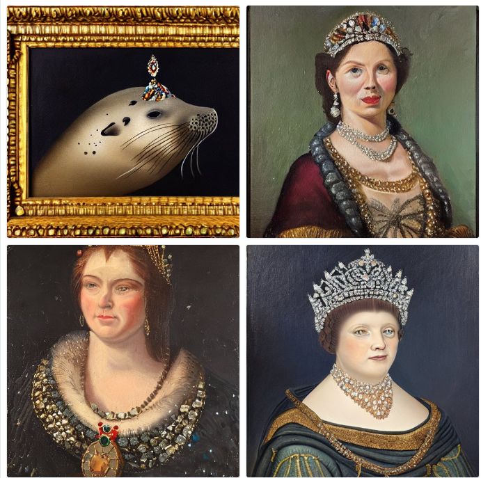
I want to start off by saying that I had so much fun trying to create silly images on the AI image tools! I have used an app on my phone where you input a picture and it edits it in certains ways depending on what settings you choose, but it did not work very well, so I was excited to try these other image rendering sites! I used 2 of the image generating AI’s: DALL-E2 and Stable Diffusion. I thought it would be interesting to use the same prompt on each site to compare what was generated.
The prompt:
an oil painting portrait of a harbour seal wearing a tiara with gems on a dark background
DALL-E: (there were a few others but this was my favorite:) )

Stable Diffusion:

Obviously there is a big difference in the results, the main one being Stable Diffusion is giving pictures of people instead of harbour seals?? I also gave a prompt involving lobsters playing poker and it generated pictures with almost all people! Due to this factor, I didn’t find Stable Diffusion very useful, but DALL-E was amazing! The more details you give the better, which allows for a lot of customization in your piece.
I also tried out Soundraw! I used the Euphoric mood/genre/theme, slow and normal for speed and included all the instruments. This was my first time using it:)
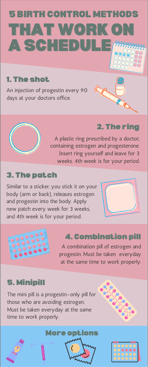
When creating my infographic, I tried to incorporate as many design principles as I could.
- I think numbering the options helps create a bit of story. It lets the reader know how many parts are in the infographic and shows them where to read next.
- The overall/key message is birth control options that are best used on a schedule, so I made sure to include a bit of a timeline/schedule for each type.
- I’d like to believe the colors make it look nicer and provide a structure that helps the reader.
- Lastly, less is more, so I included short descriptions of each type, plus a little picture to show what they might look like.
Design principles can also be related to Mayers principles. One example is the segmenting principle, which we may see by use of white space or negative space. Both ideas separates content into more bite-sized segments.

For the week 6 lesson plan, I thought it would be fitting to design a lesson for contraception methods! So I did:)

In terms of backward design use, I definitely see a resemblance to the digital arts course (AE 322) I am currently taking. In the beginning of each class we talk about what element we will focus on, why it is important, when we can use it, etc. I would say this is the big picture. The learning outcome would be that we know how to use the new element or feature effectively, like layering or typography. The evidence of learning, I think could be shown if we do the steps correctly. With layering for example, you should try to separate each layer as much as possible so you can decide how to make it look best (that’s what we were told at least). The assessment is a finished work that shows we used the specific feature/element, and learning activities I think could be practicing.
What did you notice about your learning when you listened to the Soundcloud by Howat? How was it different from reading an article?
I did enjoy listening to the Soundcloud, but I found that my eyes kept moving around because there was nowhere to look. If there were visuals or graphics to go along with the audio, I think it would have been easier to stay focussed. When comparing to an article, it is the exact opposite of listening to this Soundcloud or a podcast, and each method is only part of the dual coding theory. Personally, I would go for the article over a recording because I am more of a visual learner:)
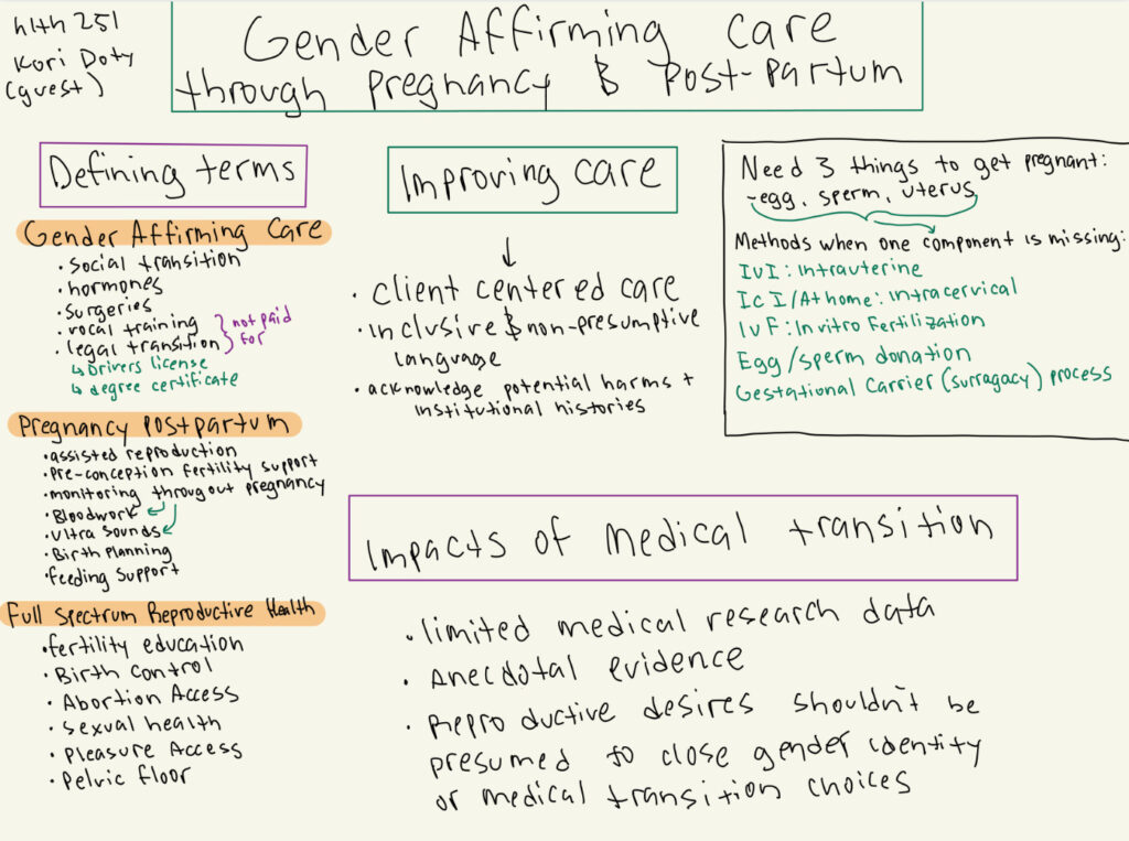
Below is the sketch note I attempted for one of my lectures (HLTH 251) who had a guest lecture. I am not really good at drawing so I wrote more than sketched, but overall I liked how I could organize the ideas in my own way. One of Mayer’s theory’s I think is involved is the Coherence principle, because we write notes (usually) on what we think will be the most important.

A few reflection questions:
What made you decide to take this course? What are your learning goals this term?
I took this course because one of my friends highly recommended it! I am interested in understanding more about the various types of multimedia and how they can be used.
Provide an example of:
Interactive Media
Video game/Wii U
- A person can interact/play and depending on their actions, it will change the output.

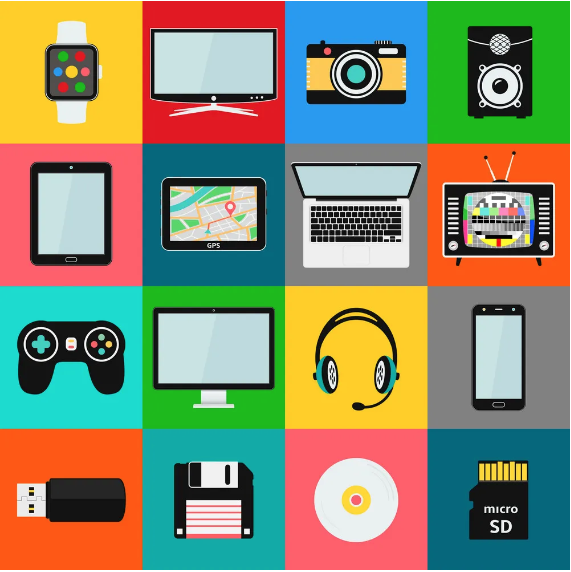
Multimedia
- Headset, phone, CD, etc.
- Multimedia is the combination of different media types
- This picture shows some of the types of media that can be used to interact with

Interactive Multimedia
Virtual Reality (VR)
- Interactive Multimedia is the combination of various media types that one can interact with
- VR combines multiple media types and allows for interaction as they control what they see

