Hi Alexa!! Awesome blog post! I totally agree with you about how professors teach their classes. I was in statistics last year and I was way more concerned and focused on just writing down everything we did rather than slowing down to understand. Would love it if some profs could just chill out for a min and go a bit slower lmao. I also had a lot of fun trying out hp5! I never realized applications like this existed and will am excited to try out creating different activities for assignment 4!
Author: oliviacorrea Page 1 of 2
We made it to the last blog post! I had a lot of fun creating this little game even though it is pretty simple:) I think h5p is great as it has a lot of options to create different activities. One that seems super cool to me is the image hotspot activity and I am planning to test it out for the group project! In terms of resources to create the activities, I think it depends on which activity you choose. If, for example, one chose a fill in the blank paragraph, you would have to ensure what you write is correct and provide information for whoever is filling it out to be able to put the right answer.
What are you hoping people learn?
I am hoping for people to learn more about types of birth control! I am almost 100% positive that most of us know what options we have, so this video is really just to show that there are so many and there is one for everyone. Though the video is short and I didn’t go too into depth about the types, maybe it’ll create an interest for someone and they can learn more on their own time!
What choices you made in creating a new video aimed at increasing knowledge transfer based on multimedia learning principles and related learning theories.
To reduce extraneous load:
Redundancy principle: To reduce extraneous, I opted to not include extra text on the screen as I was already narrating and included little pictures on each slide.
Coherence principle: I edited down the script a few times to make sure that I was saying was relevant and made sense. There was also a slight time crunch so I only included information I thought was the most important.
Signalling principle: On each slide there is a header that highlights which one of the four main types of birth controls will be spoken next. I also color-coded each type to match the main page in hopes to reduce cognitive load.
Contiguity principle: Each type of birth control has a little picture close to it of what it may look like. This also enforces the modality principle, where saying words and showing pictures is effective.
Voice principle and dual coding theory:
In my video, I explain (briefly) what each type is and what it may look like, while also providing images. This should help learners by using both systems involved in the dual coding theory, with one system that processes language, and the other processing images. Research also shows that human narration has more impact when learning:)
This was also my first time using screencast and making a video for a course! If I had to improve upon this video, I would try to fix some of the transitions between slides because for some reason in the video it went to the next one before I had actually finished the one I was on.
Video:
Hi Kate! Great post! I totally agree with you on the AI front, I hadn’t heard of any other AI tools other than ChatGBT and was really surprised at how many there was. Soundraw was also one of the tools that I tried out, and I am not sure how or when it will become useful, but I am sure something will come up for the both of us haha. In terms of the image generating tools, I agree that it can be really useful to help with a creativity block! I will admit that I was getting stumped when I was first trying to come up with a prompt for an image, but I found that after the first idea, seeing the results can help you narrow down to what you are really looking for in the image!
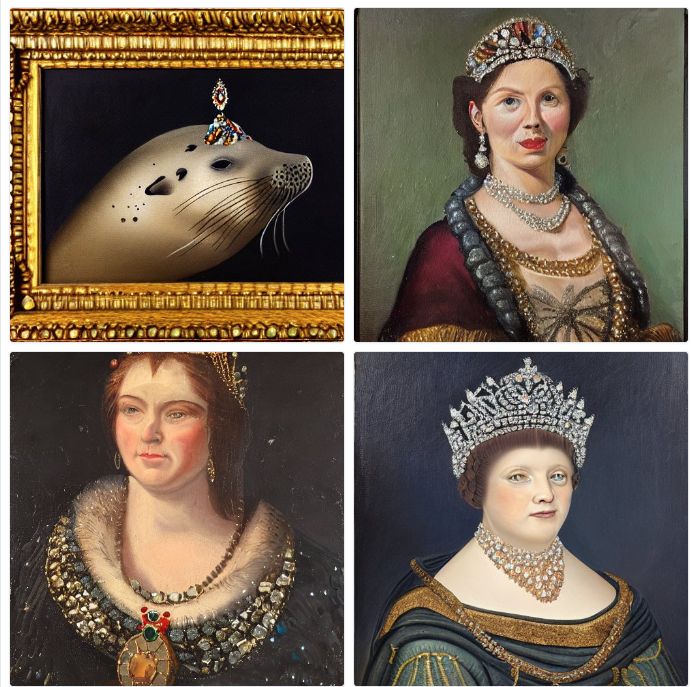
I want to start off by saying that I had so much fun trying to create silly images on the AI image tools! I have used an app on my phone where you input a picture and it edits it in certains ways depending on what settings you choose, but it did not work very well, so I was excited to try these other image rendering sites! I used 2 of the image generating AI’s: DALL-E2 and Stable Diffusion. I thought it would be interesting to use the same prompt on each site to compare what was generated.
The prompt:
an oil painting portrait of a harbour seal wearing a tiara with gems on a dark background
DALL-E: (there were a few others but this was my favorite:) )

Stable Diffusion:

Obviously there is a big difference in the results, the main one being Stable Diffusion is giving pictures of people instead of harbour seals?? I also gave a prompt involving lobsters playing poker and it generated pictures with almost all people! Due to this factor, I didn’t find Stable Diffusion very useful, but DALL-E was amazing! The more details you give the better, which allows for a lot of customization in your piece.
I also tried out Soundraw! I used the Euphoric mood/genre/theme, slow and normal for speed and included all the instruments. This was my first time using it:)
Hi Kate! Great post!! I love the colors you chose for the infographic and how it matches the pajamas, socks, hair, etc. on the character:) I especially like the sizing of the title and character because as you said, it helps those with visual impairments, so if someone couldn’t see/read the text, the image gives a pretty good idea for what the infographic is about. Overall great post, had fun reading it:)
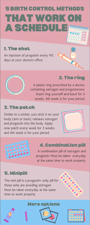
When creating my infographic, I tried to incorporate as many design principles as I could.
- I think numbering the options helps create a bit of story. It lets the reader know how many parts are in the infographic and shows them where to read next.
- The overall/key message is birth control options that are best used on a schedule, so I made sure to include a bit of a timeline/schedule for each type.
- I’d like to believe the colors make it look nicer and provide a structure that helps the reader.
- Lastly, less is more, so I included short descriptions of each type, plus a little picture to show what they might look like.
Design principles can also be related to Mayers principles. One example is the segmenting principle, which we may see by use of white space or negative space. Both ideas separates content into more bite-sized segments.

For the week 6 lesson plan, I thought it would be fitting to design a lesson for contraception methods! So I did:)

In terms of backward design use, I definitely see a resemblance to the digital arts course (AE 322) I am currently taking. In the beginning of each class we talk about what element we will focus on, why it is important, when we can use it, etc. I would say this is the big picture. The learning outcome would be that we know how to use the new element or feature effectively, like layering or typography. The evidence of learning, I think could be shown if we do the steps correctly. With layering for example, you should try to separate each layer as much as possible so you can decide how to make it look best (that’s what we were told at least). The assessment is a finished work that shows we used the specific feature/element, and learning activities I think could be practicing.
Comment on: https://mep337.opened.ca/2023/01/31/blog-post-2-multimedia-design-for-learning-sketchnoting/#comment-2
hi mary! I think your idea to create a sketch note for job descriptions is so clever! I was thinking it was mainly used for class, but I guess it can be for anything. I agree with you when you say it is great for user engagement and retention! Sketchnoting is a useful tool because it allows for us to create notes that make sense to us, and can be fun to make too!
What did you notice about your learning when you listened to the Soundcloud by Howat? How was it different from reading an article?
I did enjoy listening to the Soundcloud, but I found that my eyes kept moving around because there was nowhere to look. If there were visuals or graphics to go along with the audio, I think it would have been easier to stay focussed. When comparing to an article, it is the exact opposite of listening to this Soundcloud or a podcast, and each method is only part of the dual coding theory. Personally, I would go for the article over a recording because I am more of a visual learner:)
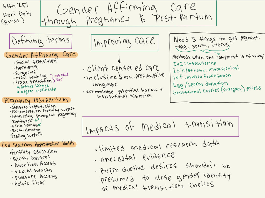
Below is the sketch note I attempted for one of my lectures (HLTH 251) who had a guest lecture. I am not really good at drawing so I wrote more than sketched, but overall I liked how I could organize the ideas in my own way. One of Mayer’s theory’s I think is involved is the Coherence principle, because we write notes (usually) on what we think will be the most important.

Hi Annie!! I love love love how you have set up your blog, it’s so cool! Congrats on almost graduating! One of my friends recommended this course and my brother also said I should take it. The dumbo illustration is too cute haha.
